
COLOR TREND : Purple
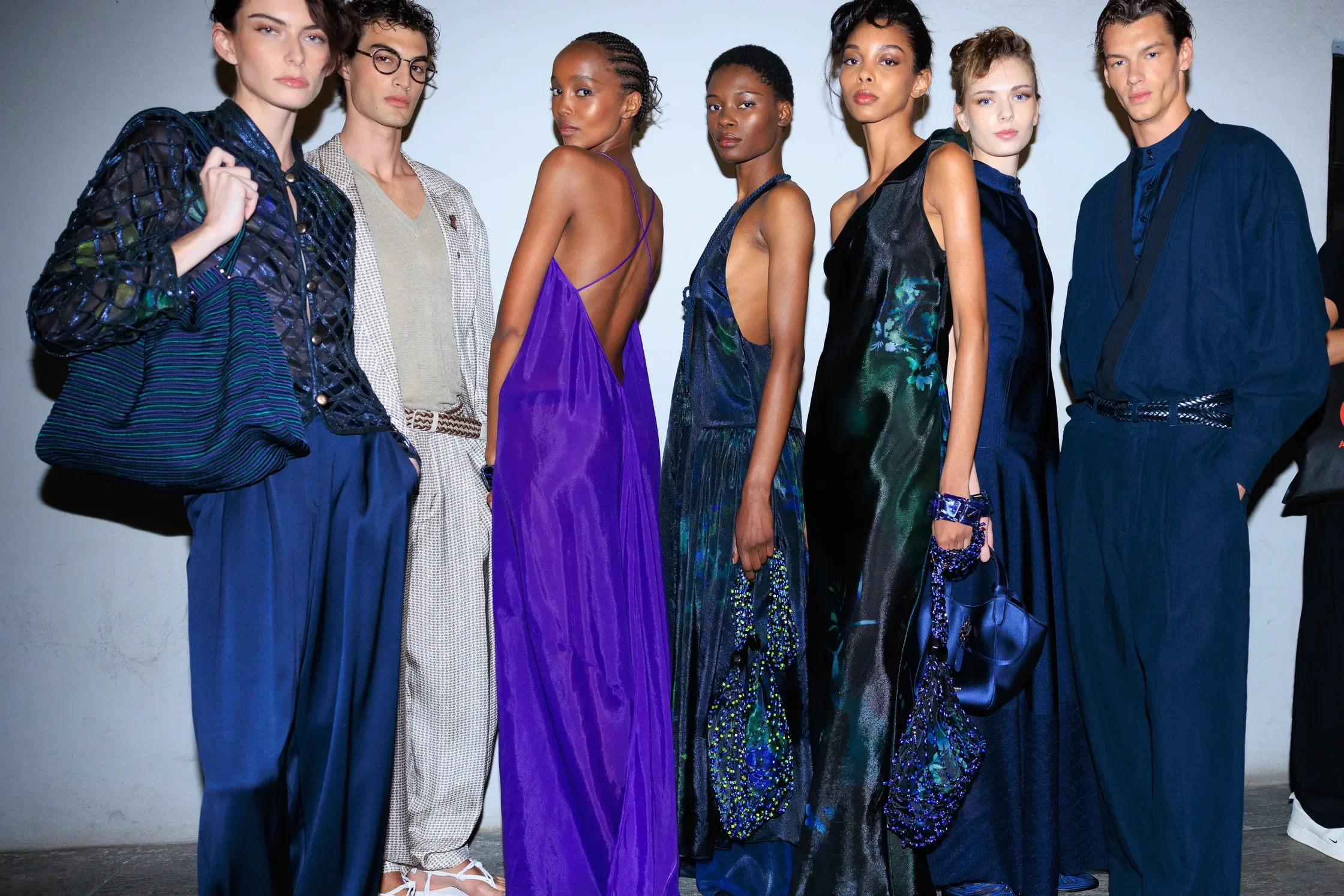
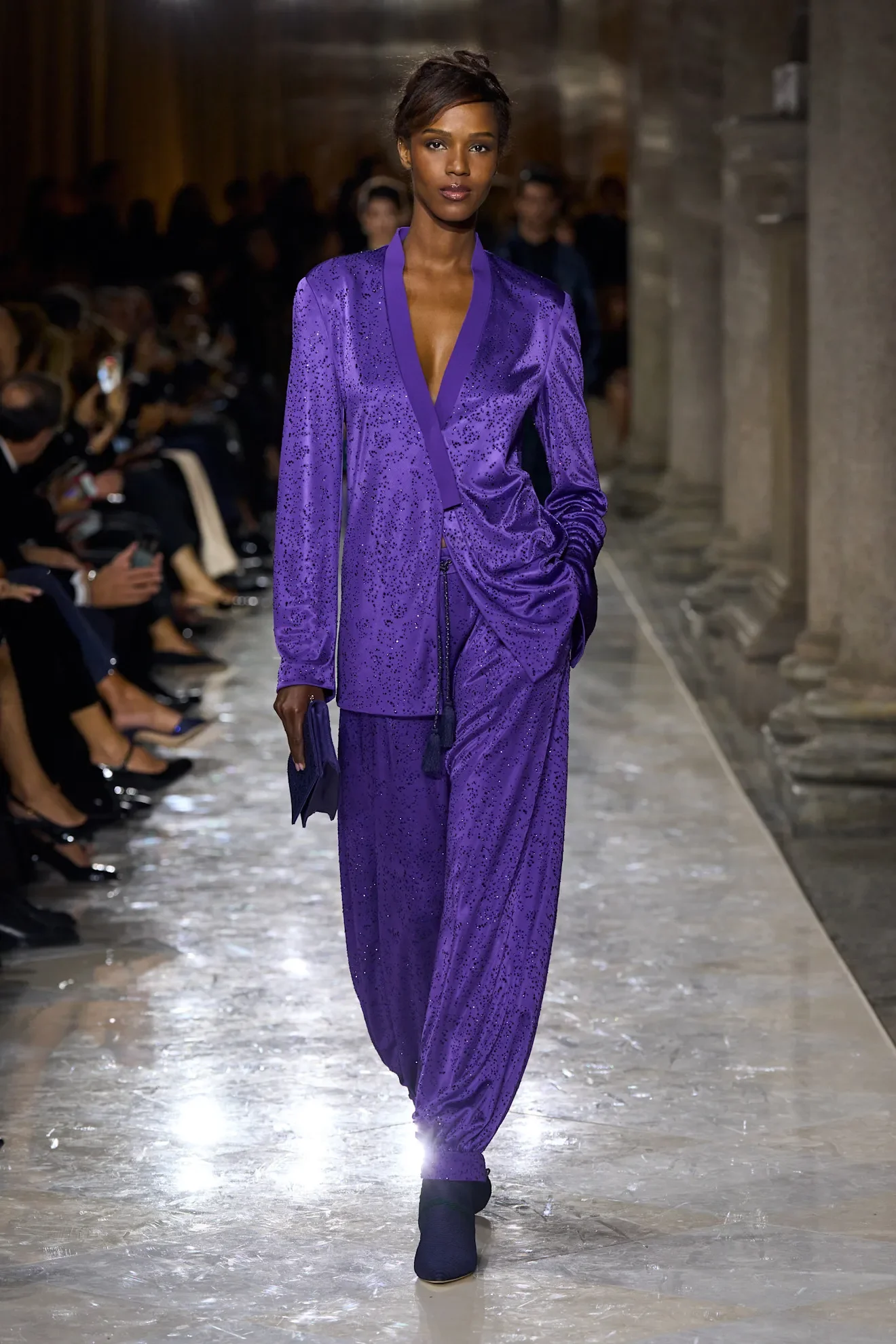
ARMANI
Purple on the 26 Runways
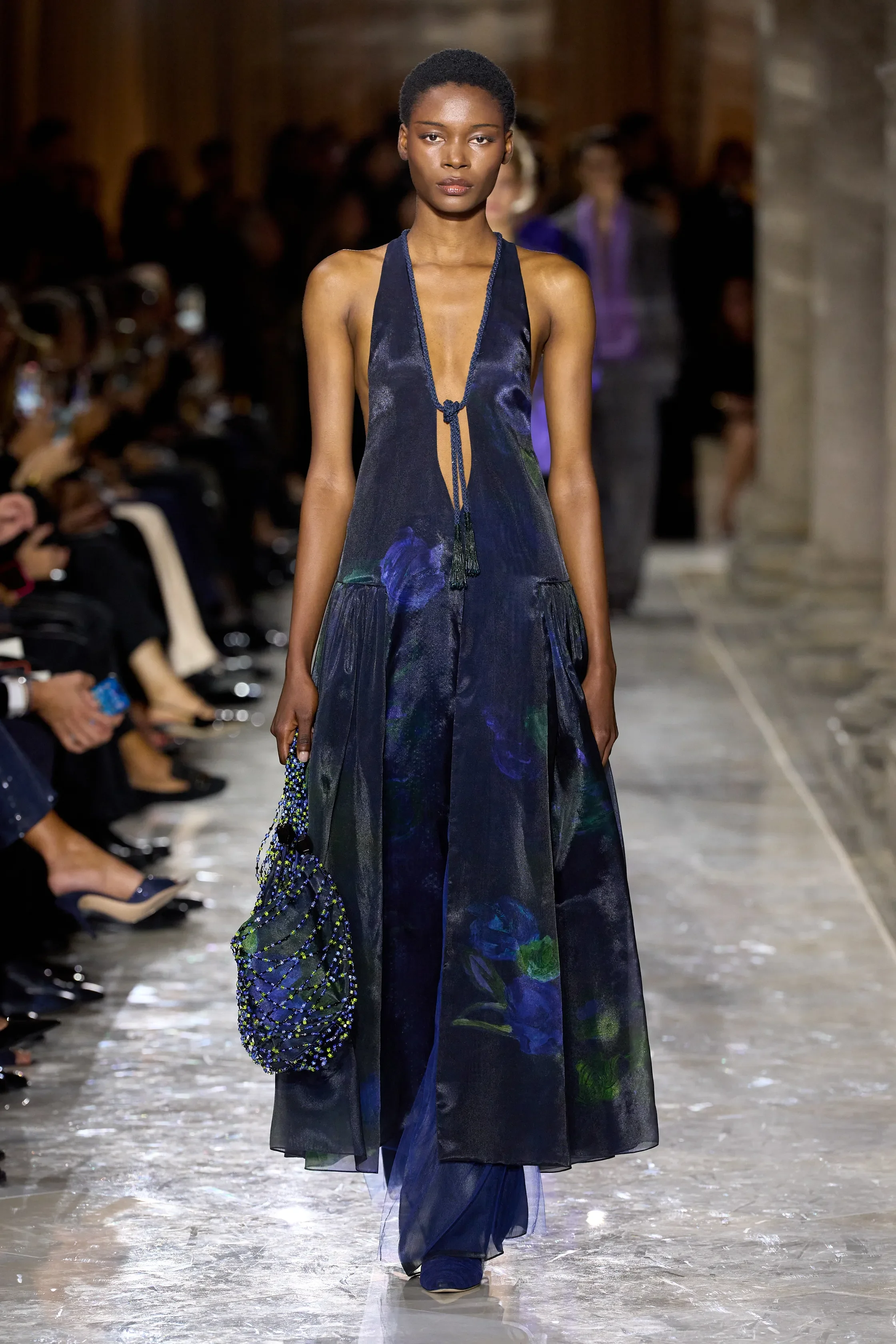
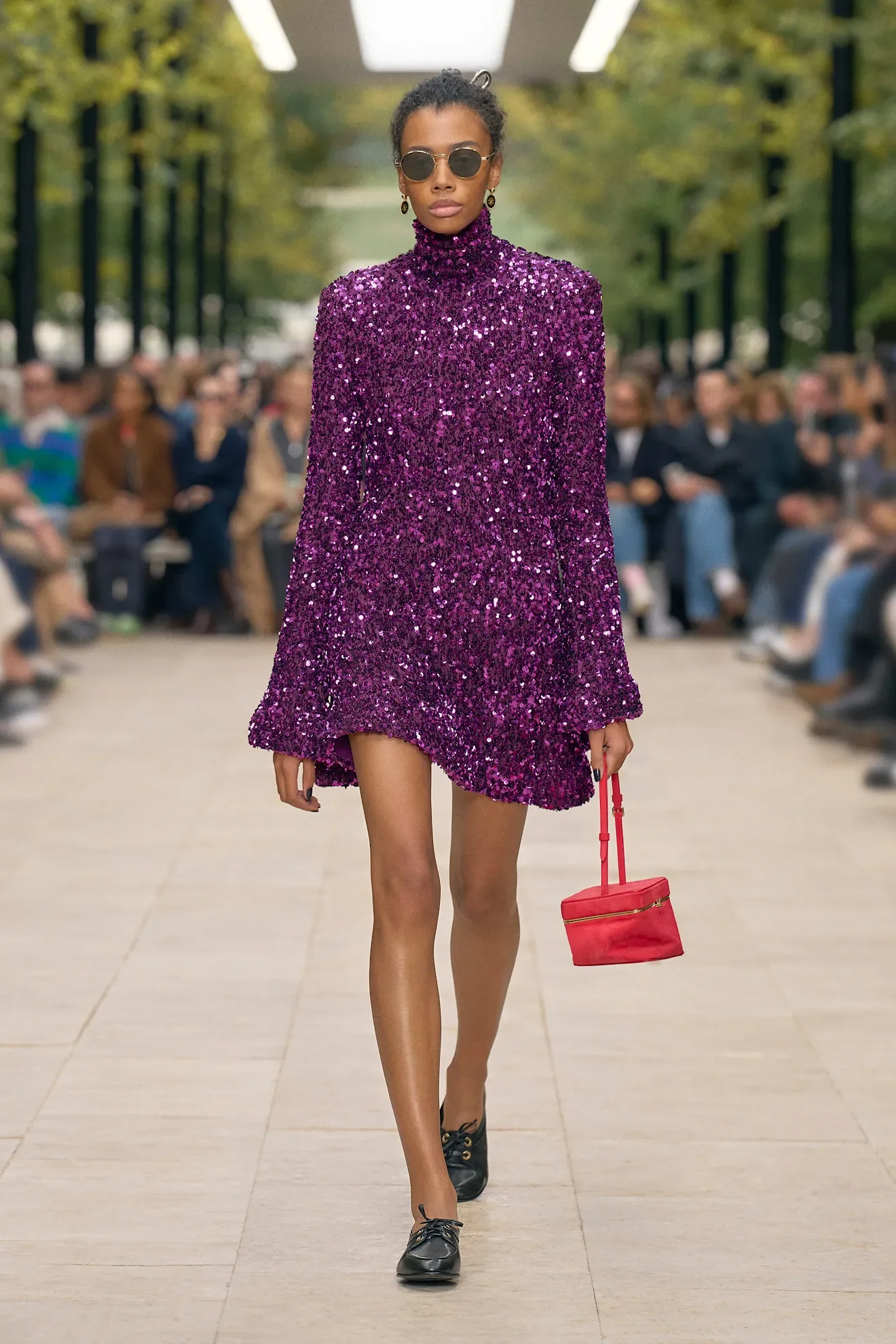
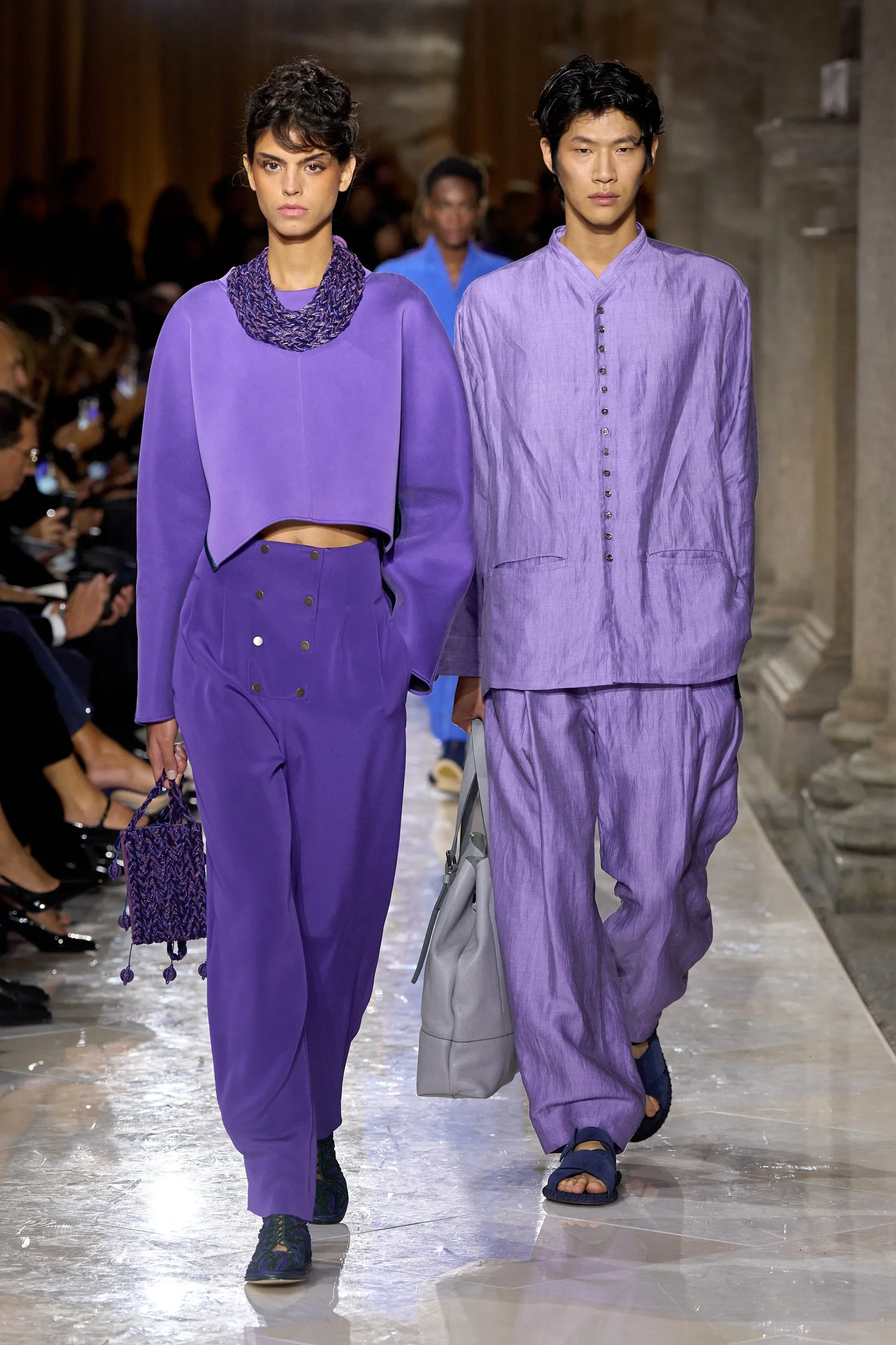
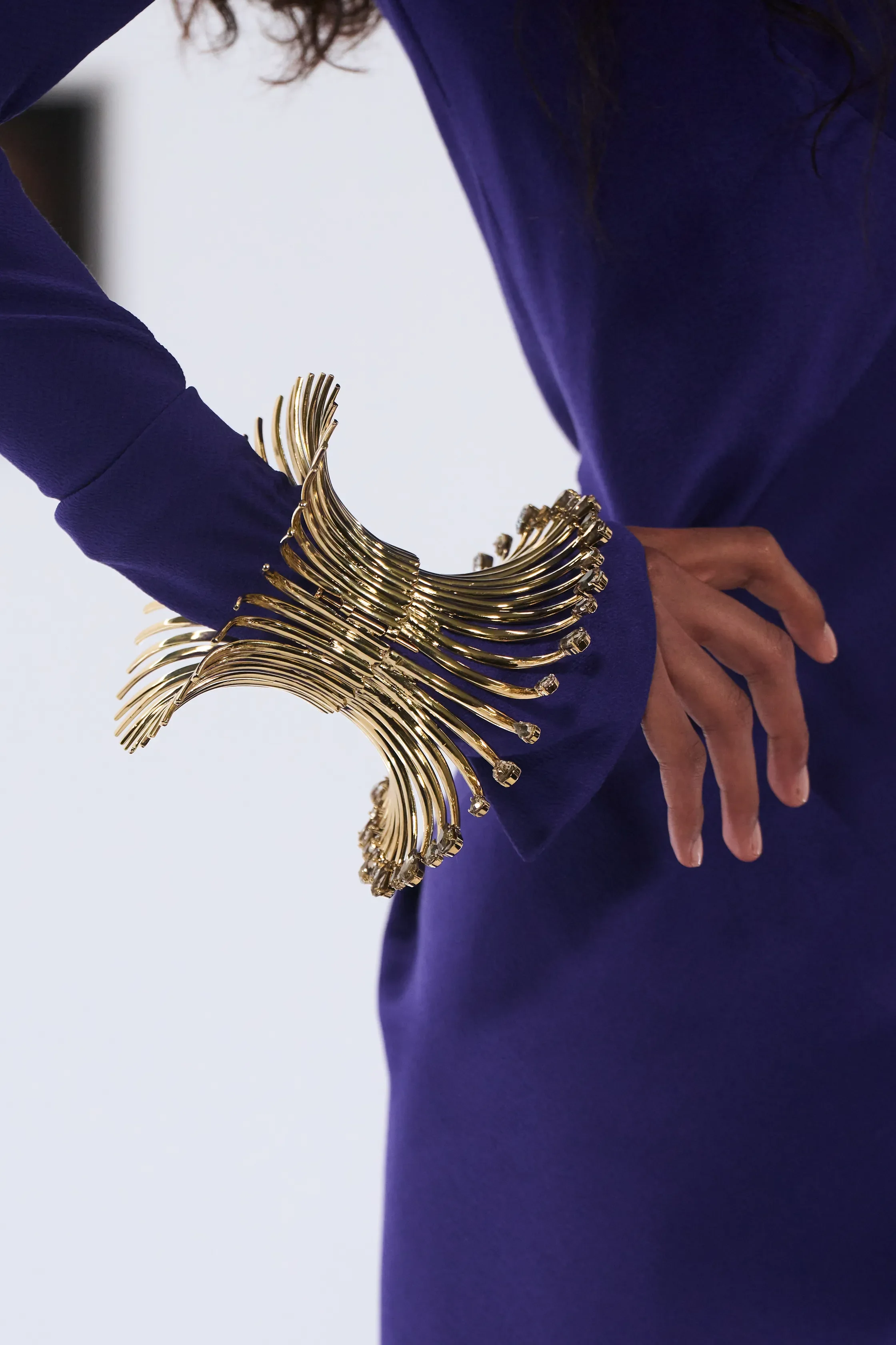
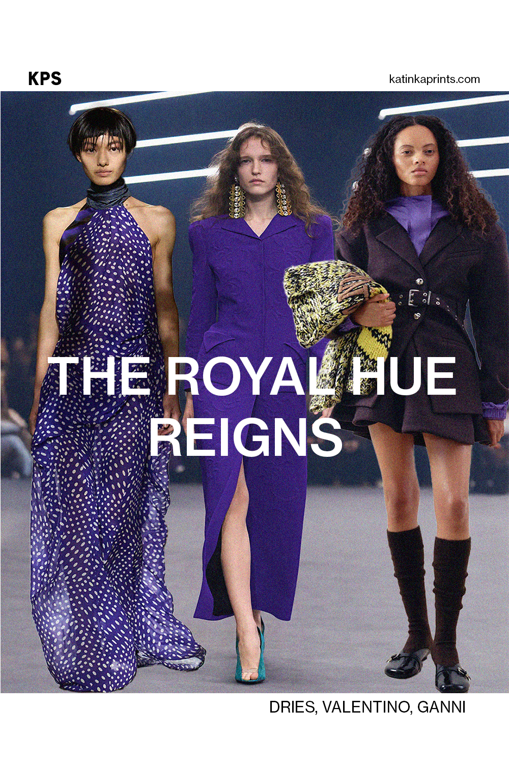
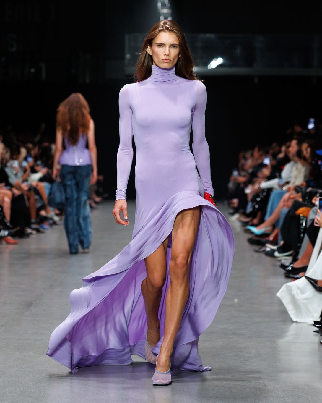
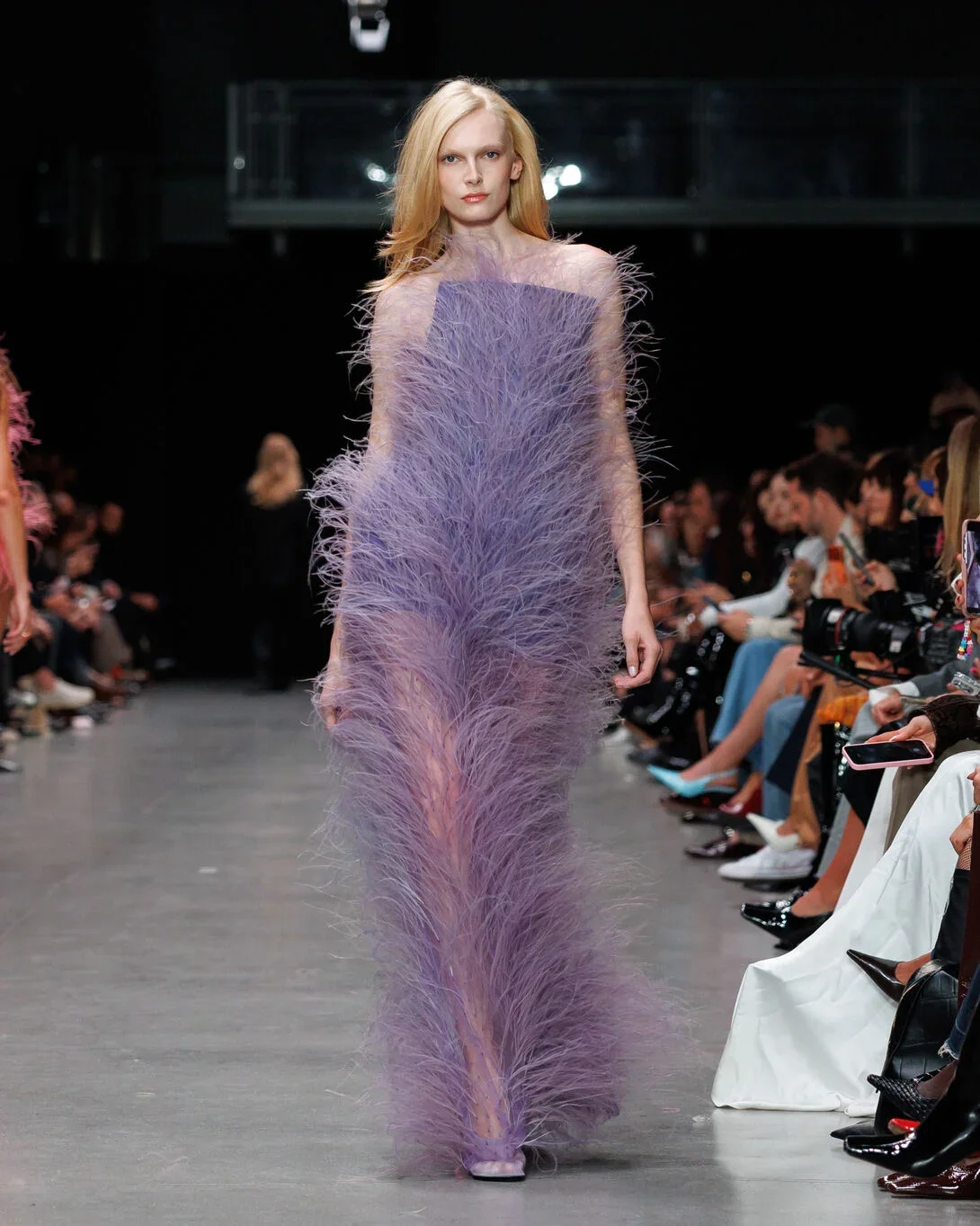
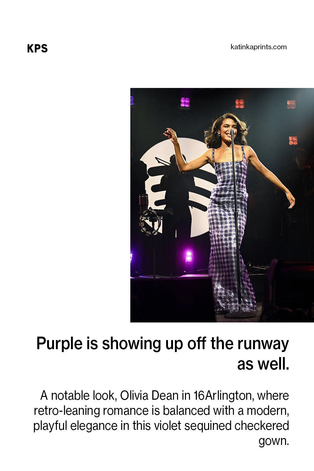
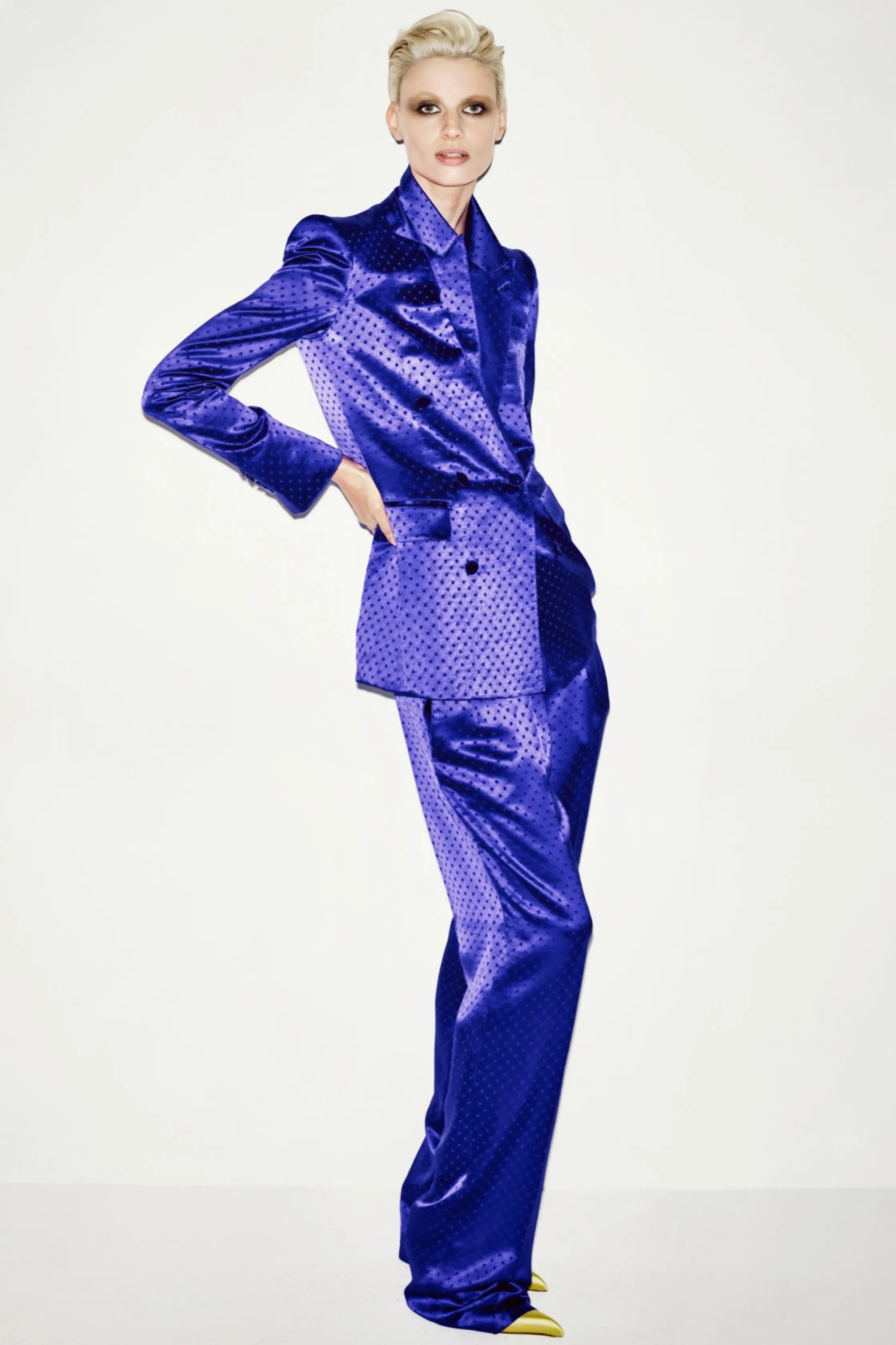
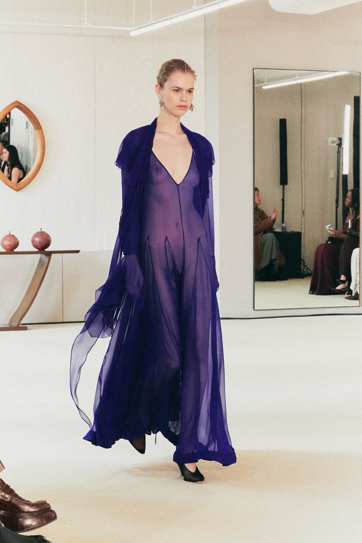
Purple doesn't trend the way other colors trend. It works in more than one direction. Balenciaga's saturated violet suiting reads nothing like the washed mauves moving through Chloé and Valentino resort, and yet both feel intentional and current. That range is what made purple one of the more interesting color stories across SP26 and Pre-Fall.
Purple showed up with such variation — inky plums at Prada, soft lilac at Armani, deep aubergine in Dries' menswear — that it functions more as a family of moods than a single color trend.
Why now makes sense
Purple has always carried a certain tension. At different moments it’s been tied to royalty, psychedelia, glamour, spirituality, kitsch. It can feel quiet and introspective or completely attention-seeking depending on the shade and how it’s used.
That range is part of why it worked so well this season. Across categories, there was a clear move toward expression over strict trend conformity, and purple naturally fits that mood. It doesn’t belong to one aesthetic camp. It feels more like a personal choice than a prescribed trend.
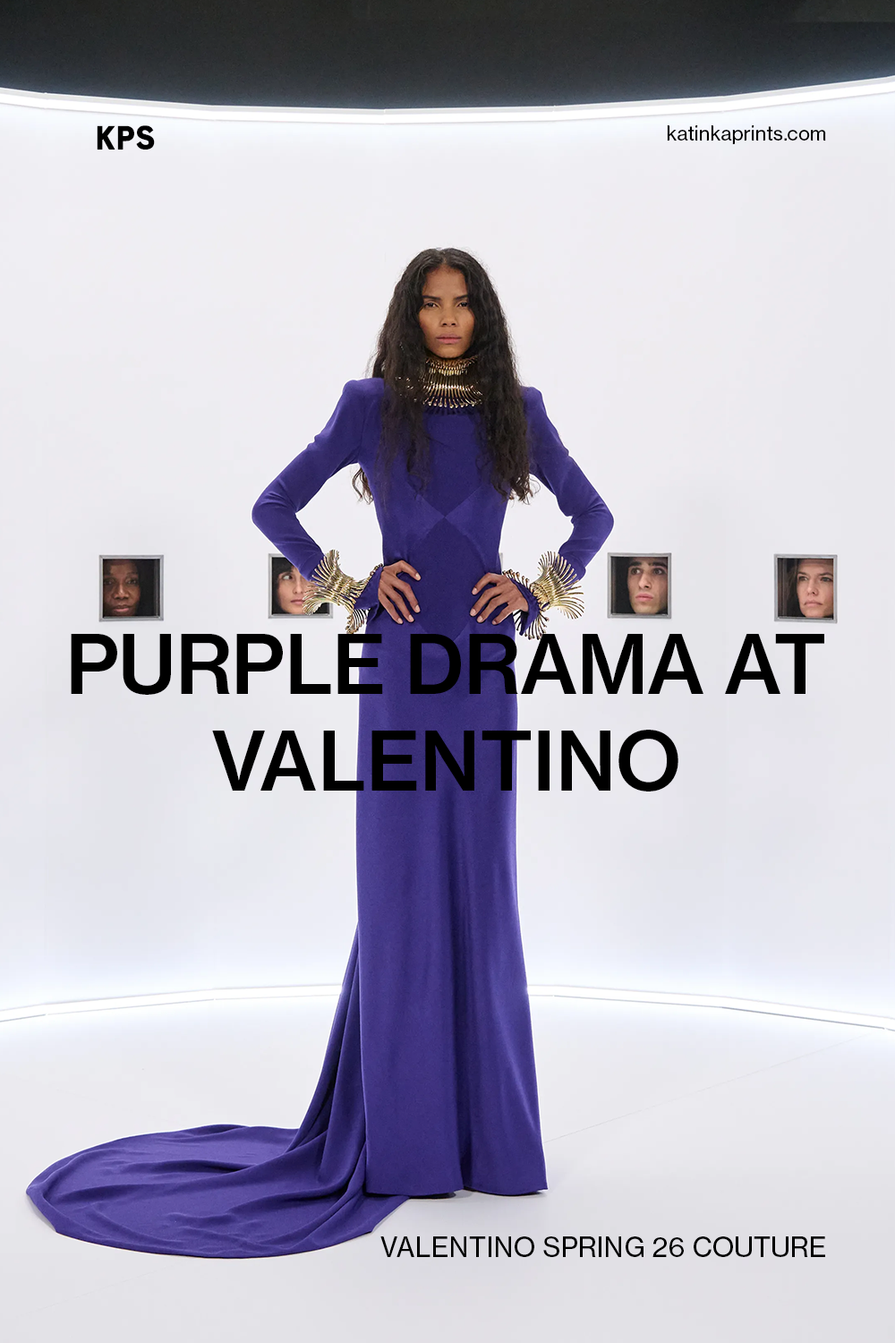
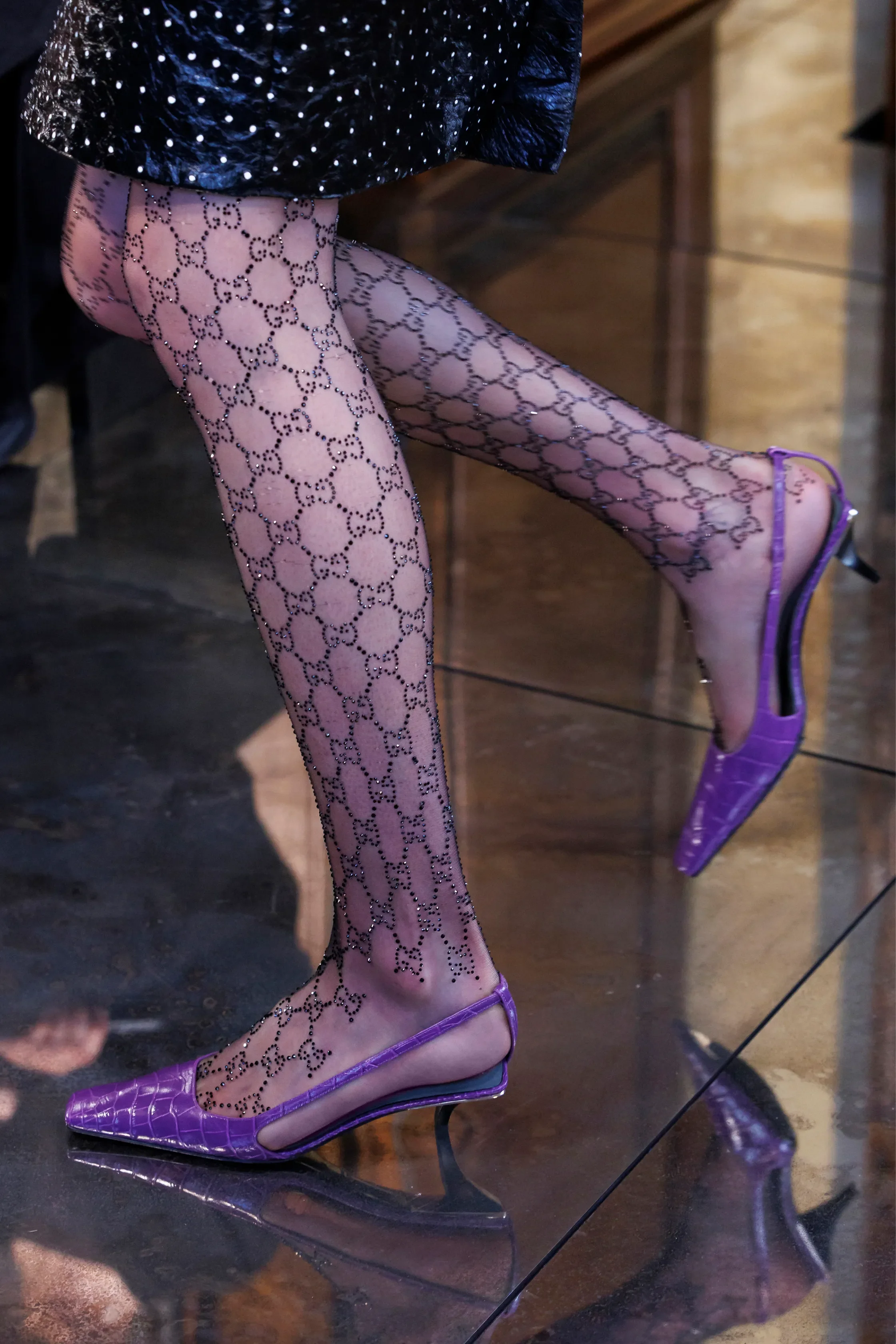
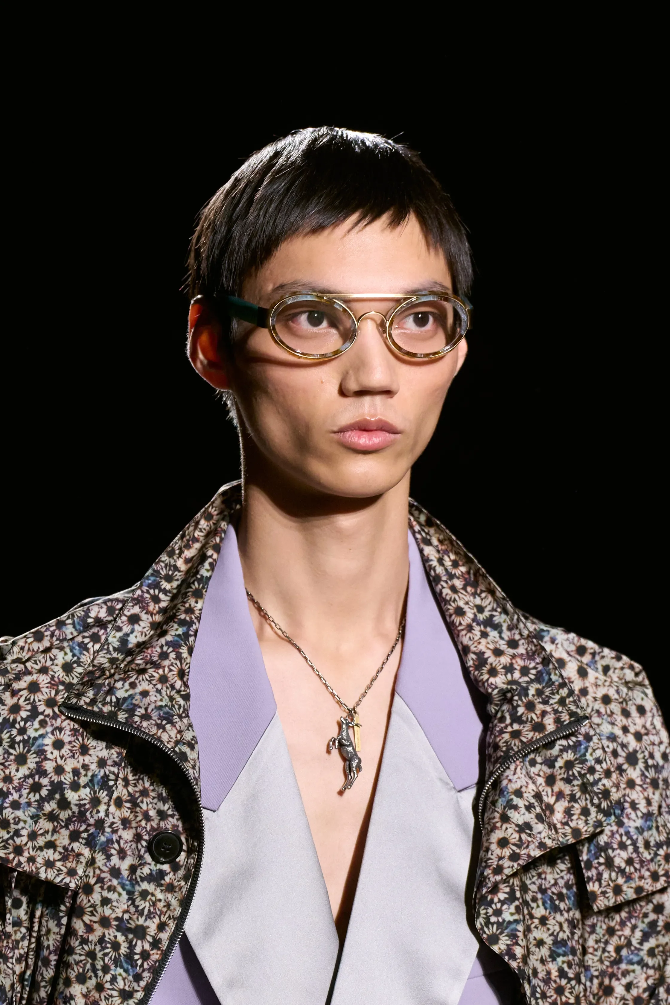
Purple in Print Design: Opportunities for Brands
In print, the opportunities are more specific than the trend coverage suggests.
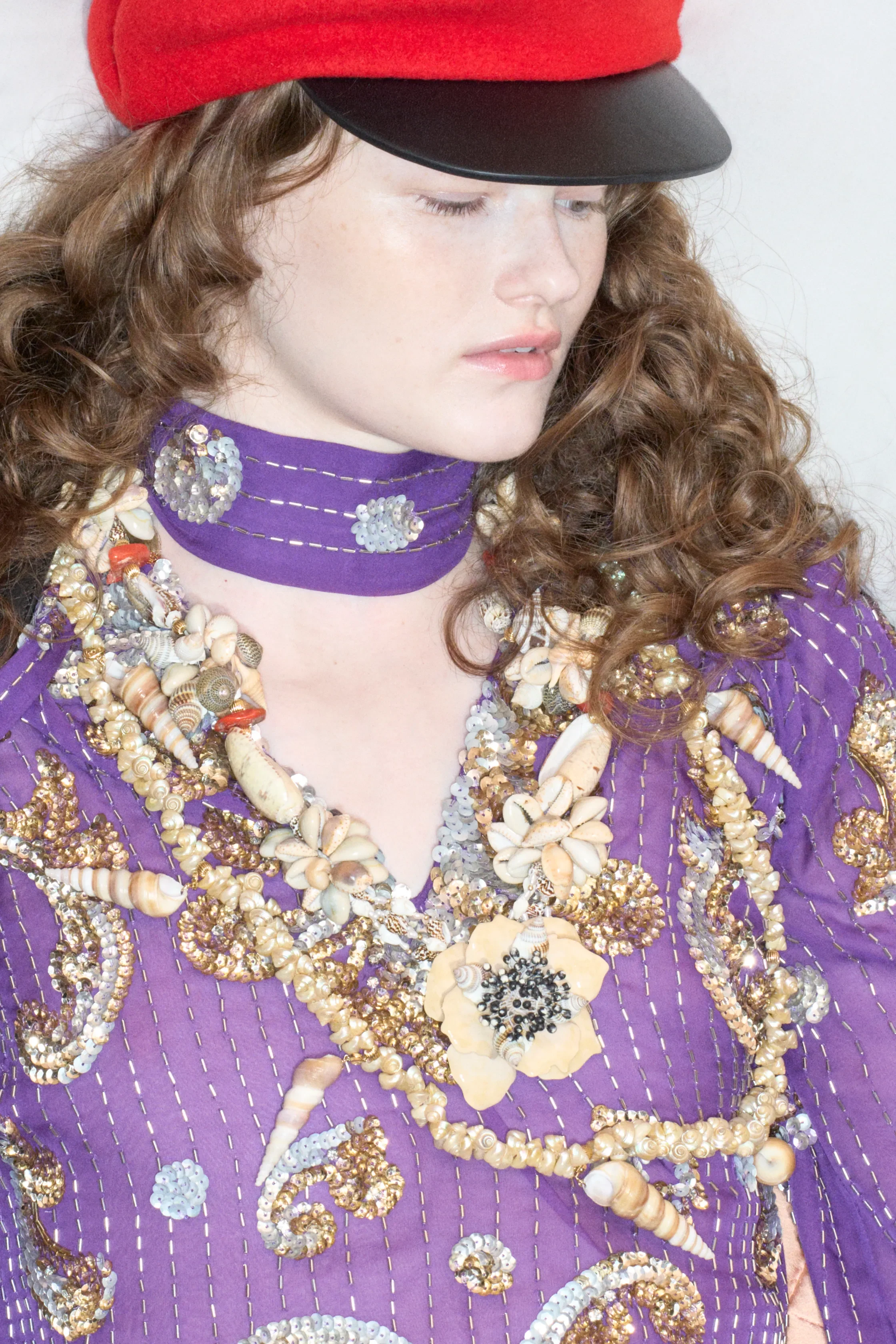
As a ground, deeper plums and aubergines create richness without the visual noise that saturated brights can introduce, particularly useful in macro florals where the motif needs room to read.
As a second colorway within an existing print story, dusty lilac lets a brand push something softer and more commercial without having to redesign the print entirely. Purple also has enough range that it can move across different aesthetics and price points without the collection feeling disconnected.
When used intentionally, purple becomes a powerful storytelling tool. In print design, it allows brands to build atmosphere and emotional depth, supporting both statement pieces and subtle, mood-driven surfaces that feel contemporary and forward-looking.
Final Thought
The color that keeps coming back is the one that keeps changing what it means. For brands building long-term visual identity, this makes purple less of a trend to follow and more of a color story to interpret.