
Pattern Stacking
ETRO SP26
Pattern Stacking — The Print Story of SP26
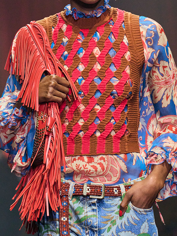
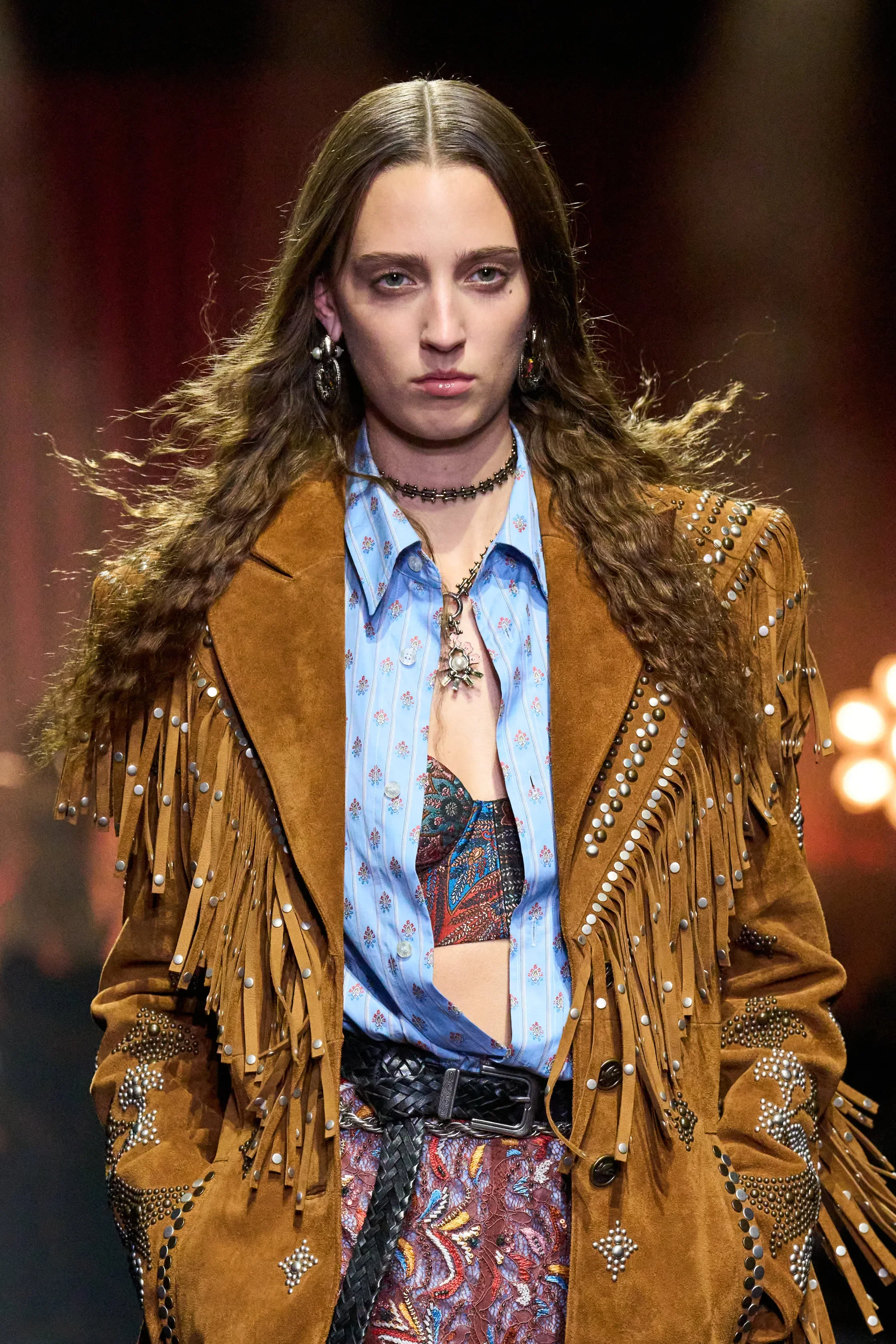
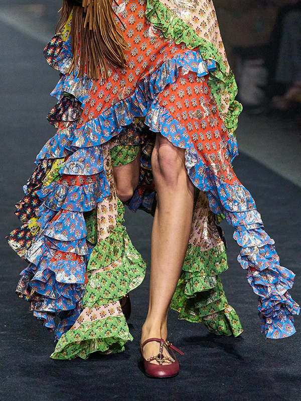
Our favorite print moment of SP26 wasn't about bolder motifs, but about unexpected layering. Pattern stacking showed up across the season with enough consistency to read as a design shift: florals over stripes, checks running into paisley, embroidered textures sitting alongside printed panels. The result isn't chaotic, but reads as personal and thoughtfully assembled.
What separates pattern stacking from maximalism is the composition. Pattern stacking is not piling prints on top of each other for the intention to clash. It is deliberately holding the complexity of multiple patterns through a masterful use of color, scale and texture.
How it shows up
On one garment: overprints, engineered placements, and mixed techniques (weave, embroidery, print) that create a single, rich surface.
In a look: multiple distinct prints combined with confident editing so the outfit feels curated instead of cluttered.
Three designers showing the way
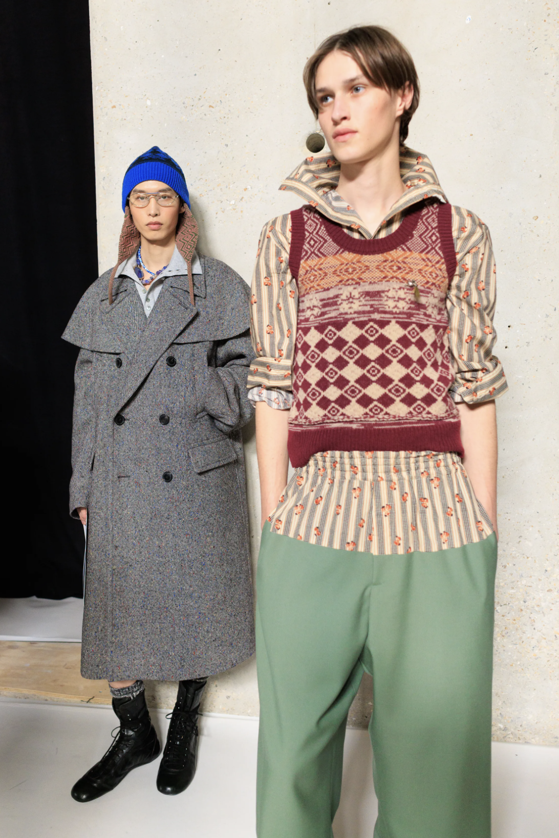
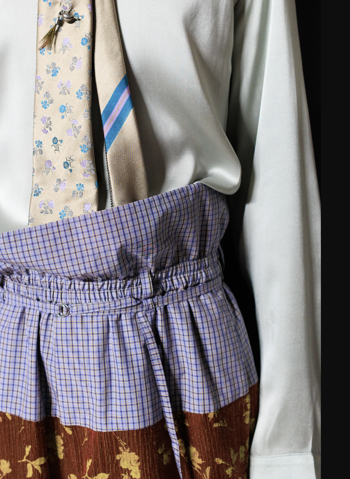
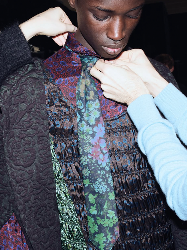
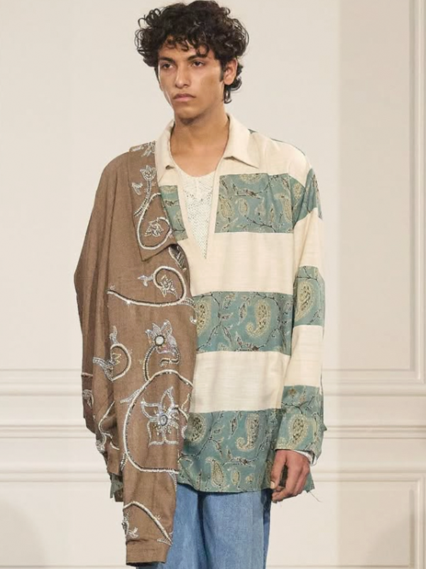
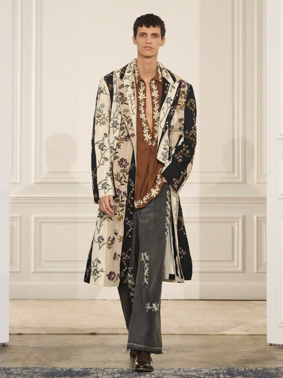
Dries Van Noten:
Julian Klausner's SP26 menswear debut stacked florals, checks, stripes and paisleys onto a single look and made it feel effortless. The collection’s color story is what made the print stacking feel coherent rather than chaotic. Saturated pairings were consistently grounded by a muted counterpoint that kept the visual complexity from reading as noise. Red against cyan, orange against mauve, always balanced by a quieter hue. The color balance resolved the tension of the surface patterns before the eye even had time to process the motifs themselves.
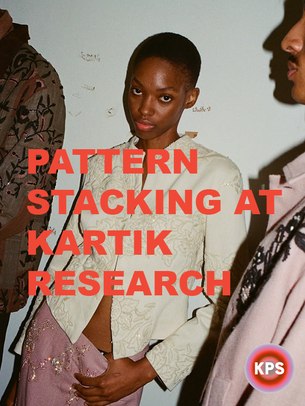
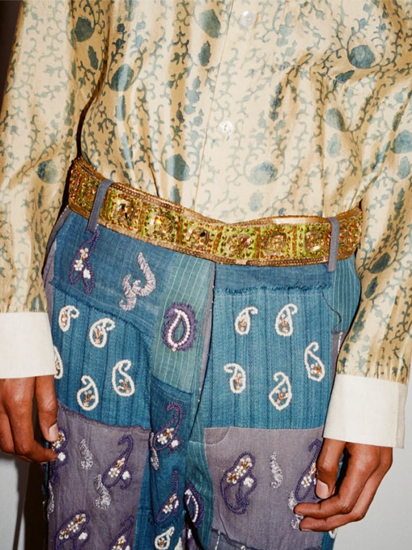
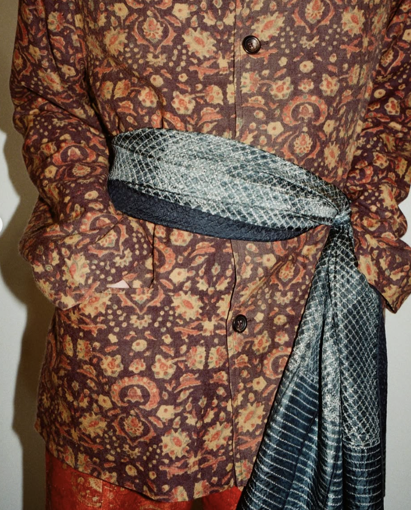


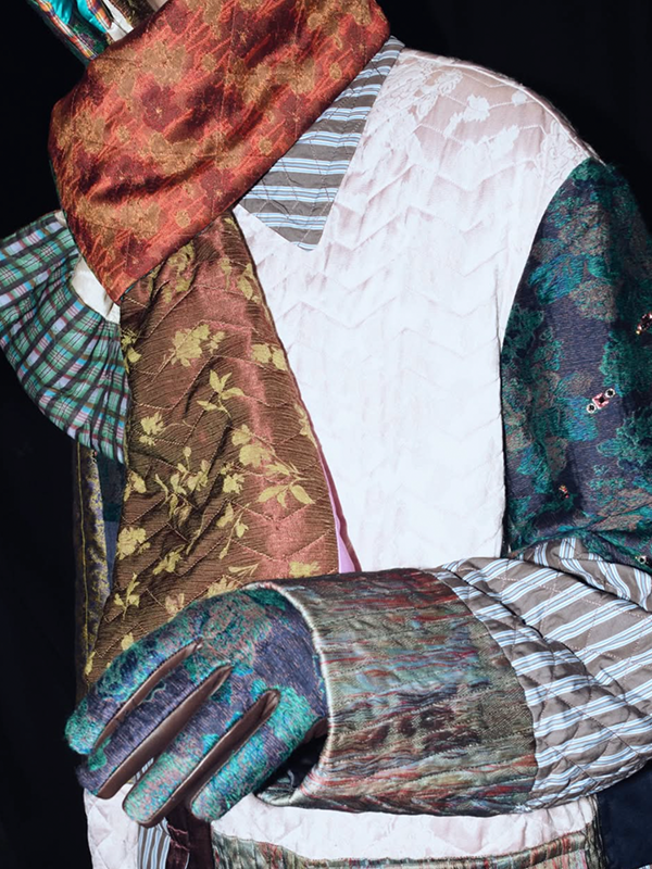
Kartik Research:
Pattern stacking in the Kartik Research SP26 collection feels deeply tactile. Block print, kantha stitch and handloom weave each bring a distinct emotional and aesthetic language shaped by their regional and historical origins. Block printing is rhythmic and ornamental, kantha is intimate and lived-in, and handlooms feel grounding through their very construction.
Together, these crafts create a conversation between surface, texture and history. The result is a textile story that feels inherited and deeply human.
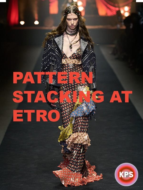
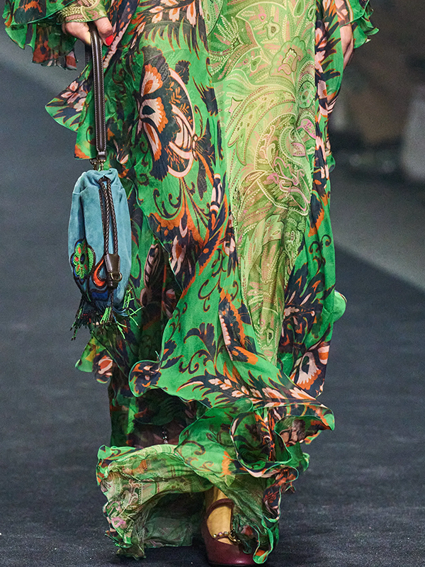
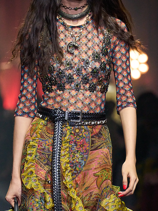
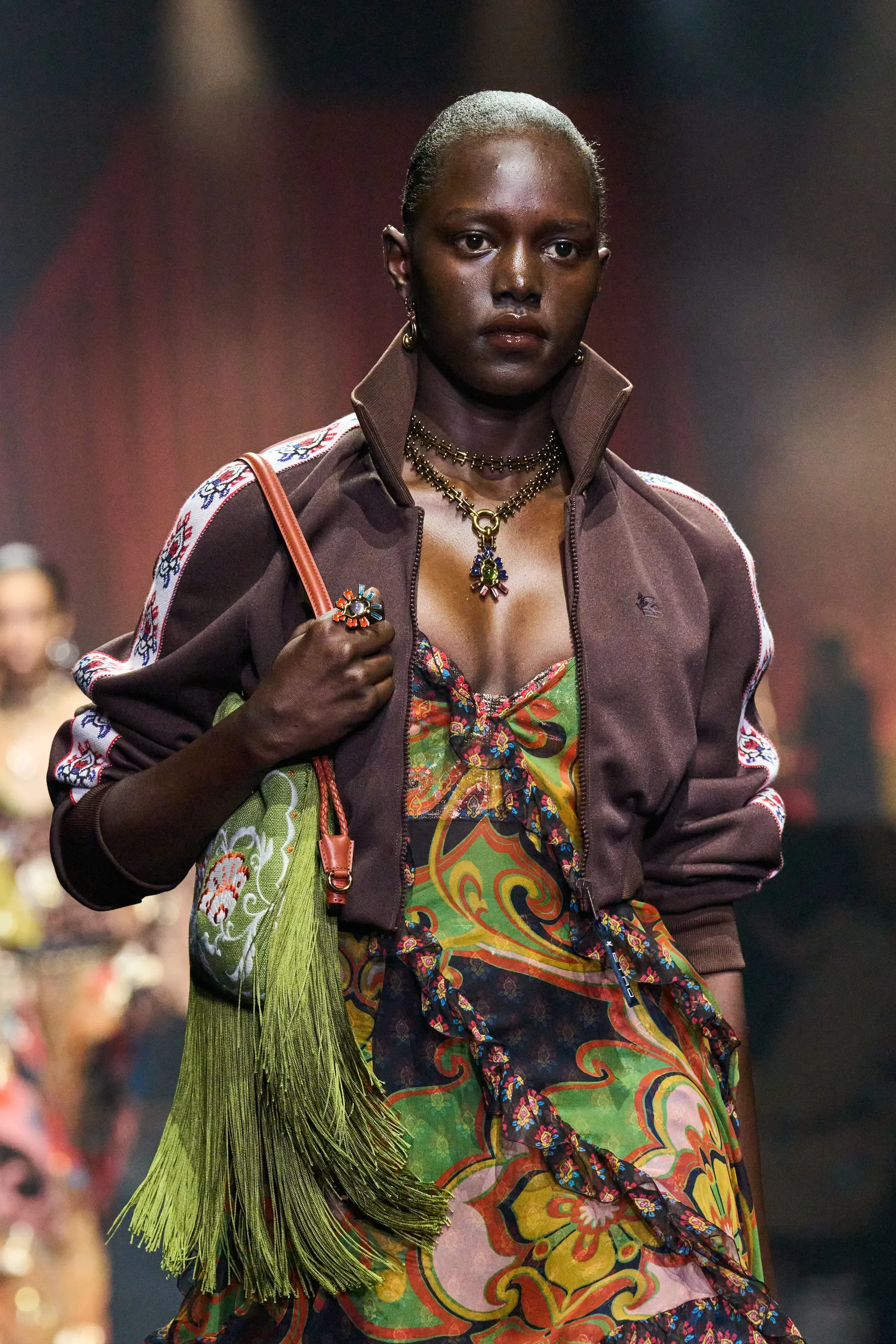
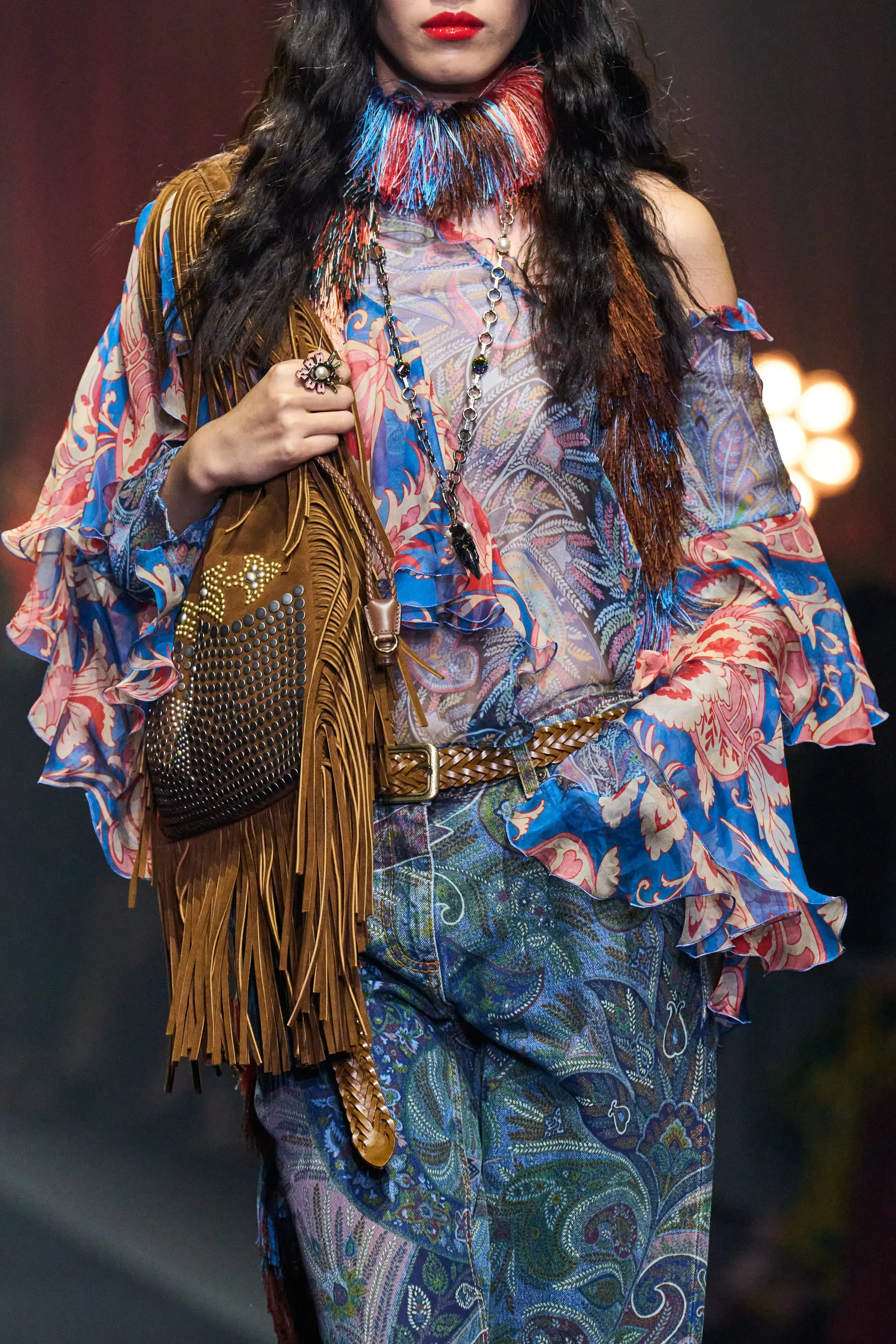
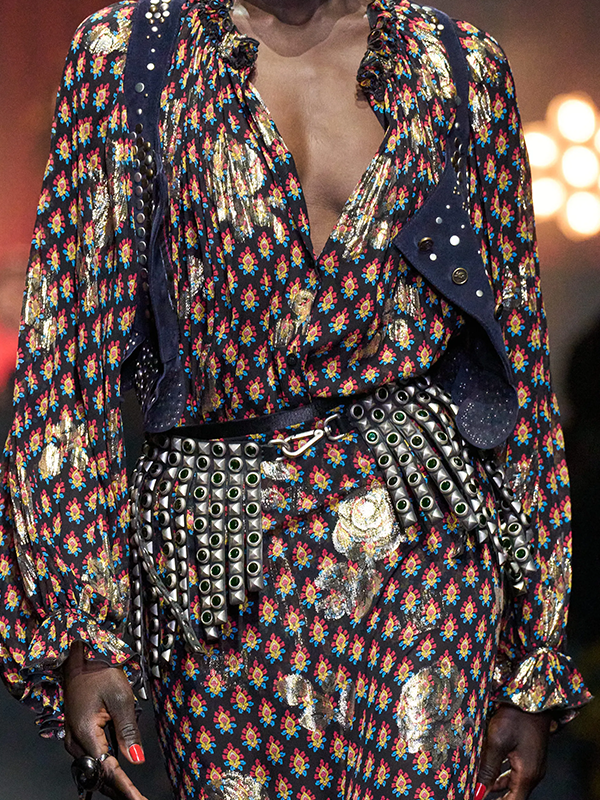
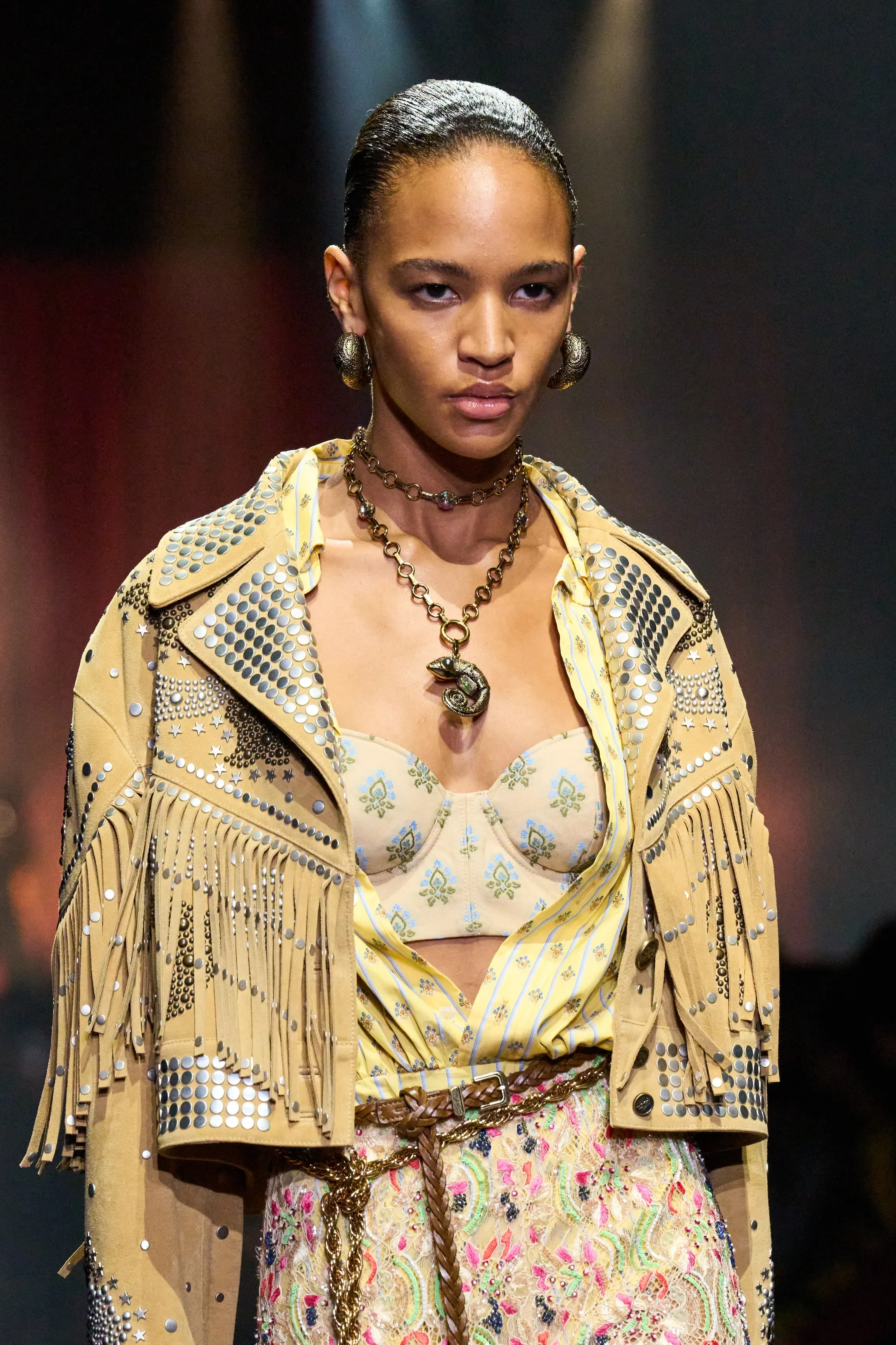
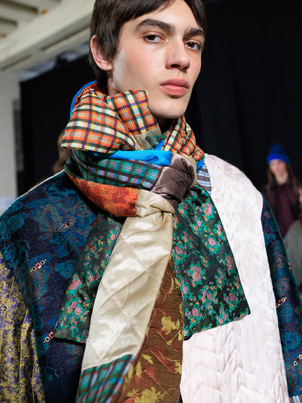
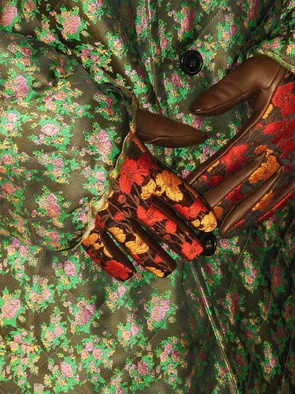
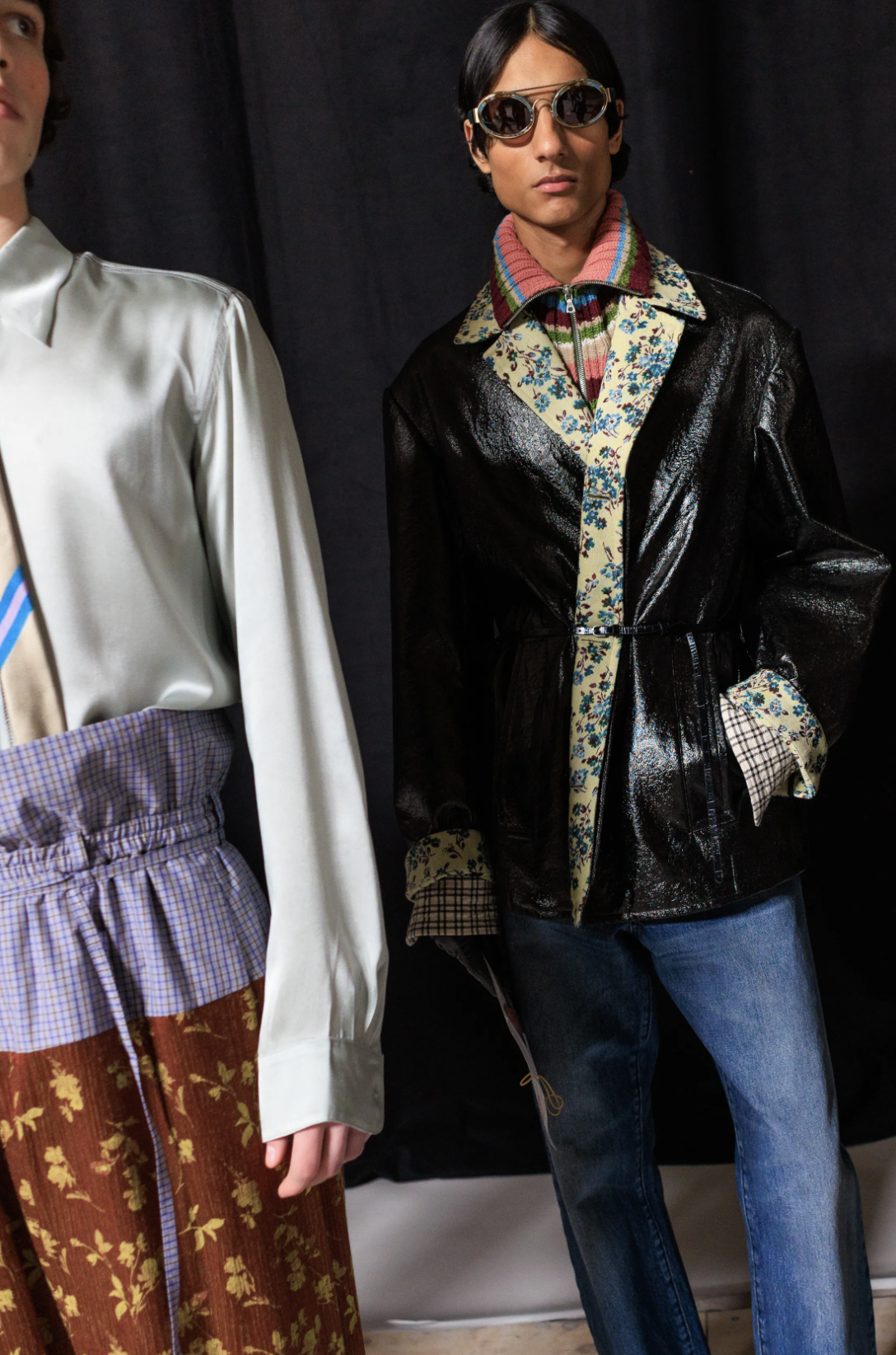
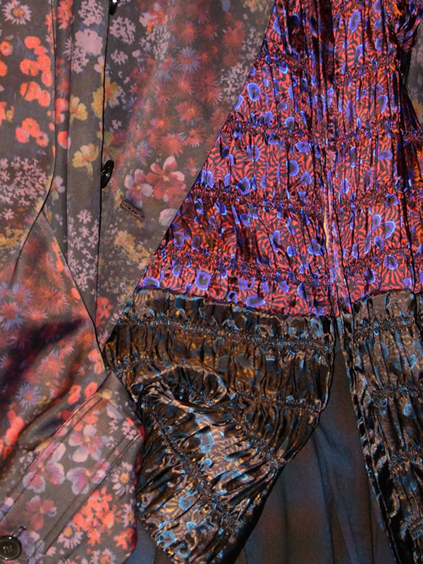
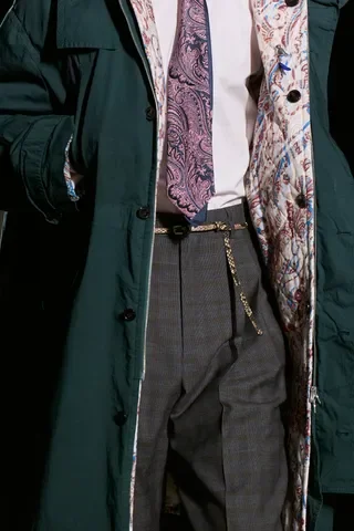
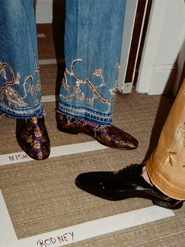
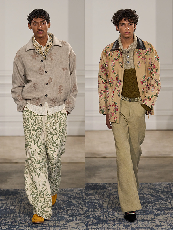
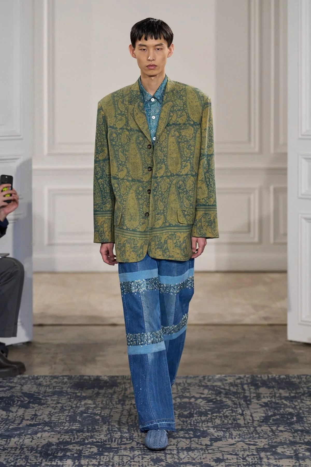
Etro:
The most technically specific of the three. Micro repeats paired with metallic overlays, contrasting colorways of the same print used within a single garment, patchworks of paisley and scarf motifs at varying scales and densities. Etro's heritage folk print vocabulary is doing a lot of cultural heavy lifting here. The stacking feels nostalgic and freshly strange at the same time, which is a difficult balance to hold.
Why we love it
For brands, pattern stacking is a way of strengthening visual language. It’s about building a set of motifs and surface techniques that can stand on their own, but also work together without feeling forced. At its best, it means a customer can look at a rack/lookbook/Instagram grid and recognize the brand instantly, without needing to see a label. The prints carry a point of view that extends beyond any single motif.
Pattern stacking also stress-tests that language. If your motifs only work in isolation, you don’t really have a language, you just have a set of individual prints. Stacking shows whether the prints actually relate to each other, or whether they only work when they’re standing alone.
A big part of why pattern stacking is resonating right now is because people want clothes that feel more expressive and individual. Pattern stacking taps into that by making a single garment feel like it’s been built up over time, with prints that suggest different sources, moods and moments. Even when it’s all designed within one collection, it still carries a sense of accumulation.
There’s also a value perception at play. The more intricate the surface (when done well), the more elevated it feels. That becomes part of the customer appeal. It signals a high attention to craft and detail.
How to design it
Anchor with a tonal palette. Shared color or balance keeps contrasting motifs readable.
Vary scale deliberately. Micro motifs and larger prints need enough difference to avoid visual competition.
Mix techniques. Embroidery or woven texture alongside a printed surface adds tactile depth that photography barely captures, but the customer feels it in store.
The Takeaway
Strong prints don't always need to stand alone. Sometimes the most interesting thing a print can do is hold a conversation.
If you are interested in developing a cohesive, layered print language for your brand, we would love to explore that with you.